From Clutter to Clarity: Reimagining CashKaro's Digital Store
The mantra has been clear for years: everyone loves a cashback in India.
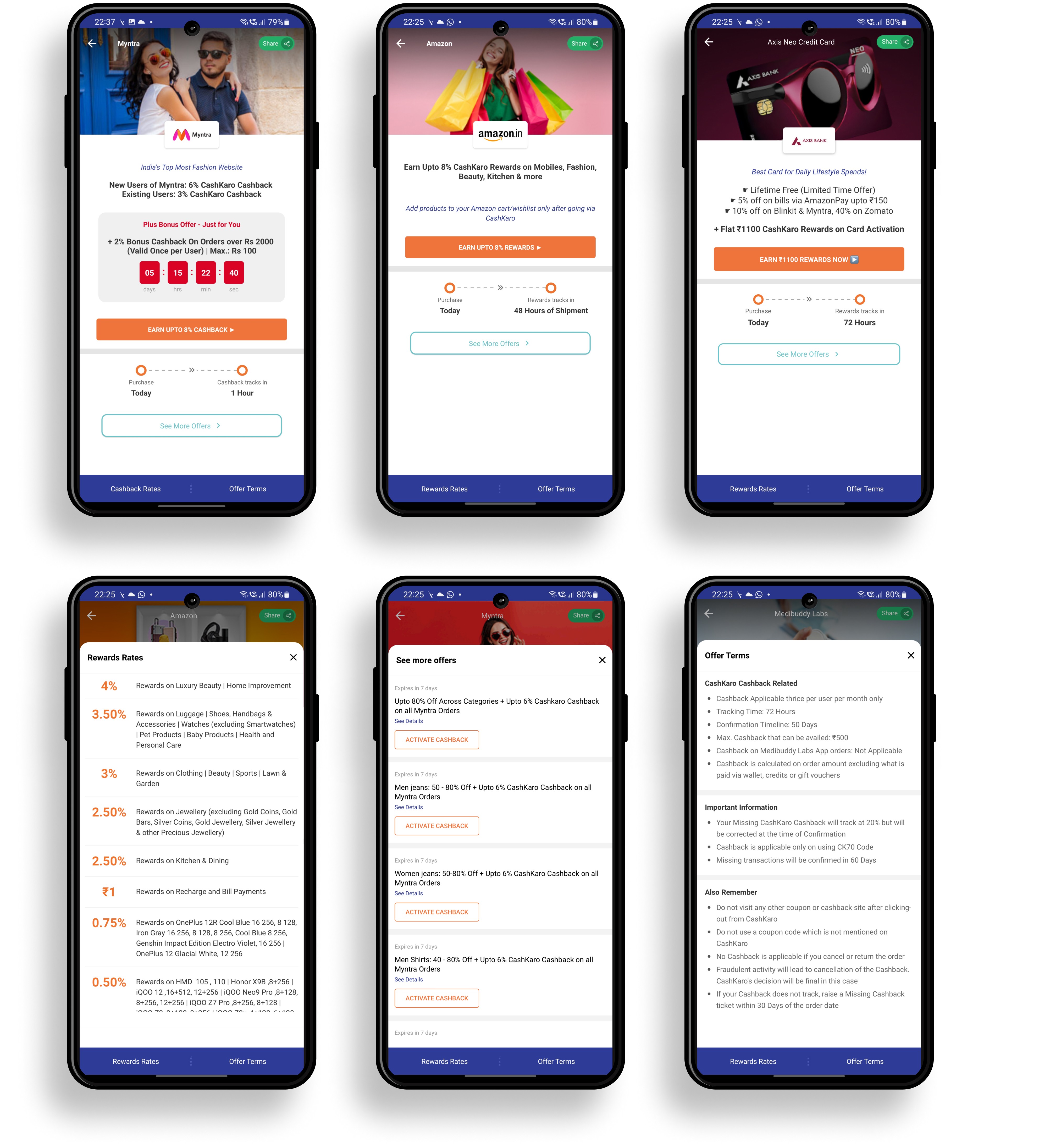
While the excitement of getting real money as cashback is unfathomable, CashKaro’s store pages were a tangled mess. Hidden terms and conditions and confusing offer structures turned a simple shopping experience into a frustrating one. Users were left scratching their heads, wondering why their promised cashback was nowhere to be found.
Determined to change this, I set out to redesign the store page from the ground up, where I challenged assumptions and explored how a user-centric approach can revolutionise how we save money.
Since its inception in 2013, CashKaro transformed from a small coupon discount app service to India’s largest cashback and coupon app with 18+ million users and ₹100 crores in revenue.
Getting real money through CashKaro was a revolutionary idea. By 2022, over 2 lakh missing cashback queries per month alone painted a concerning picture—the app, struggling to keep pace with users’ expectations, was failing to deliver on its core promise, leaving users frustrated and disappointed. Core usability principles were compromised by a lack of focus, inconsistent features, and escalating performance issues.
The Digital Store
CashKaro’s digital storefront served as a significant user touchpoint, showcasing potential savings (its value proposition) to users.
It allowed them to browse various offers and seamlessly complete their purchases.
The Problem
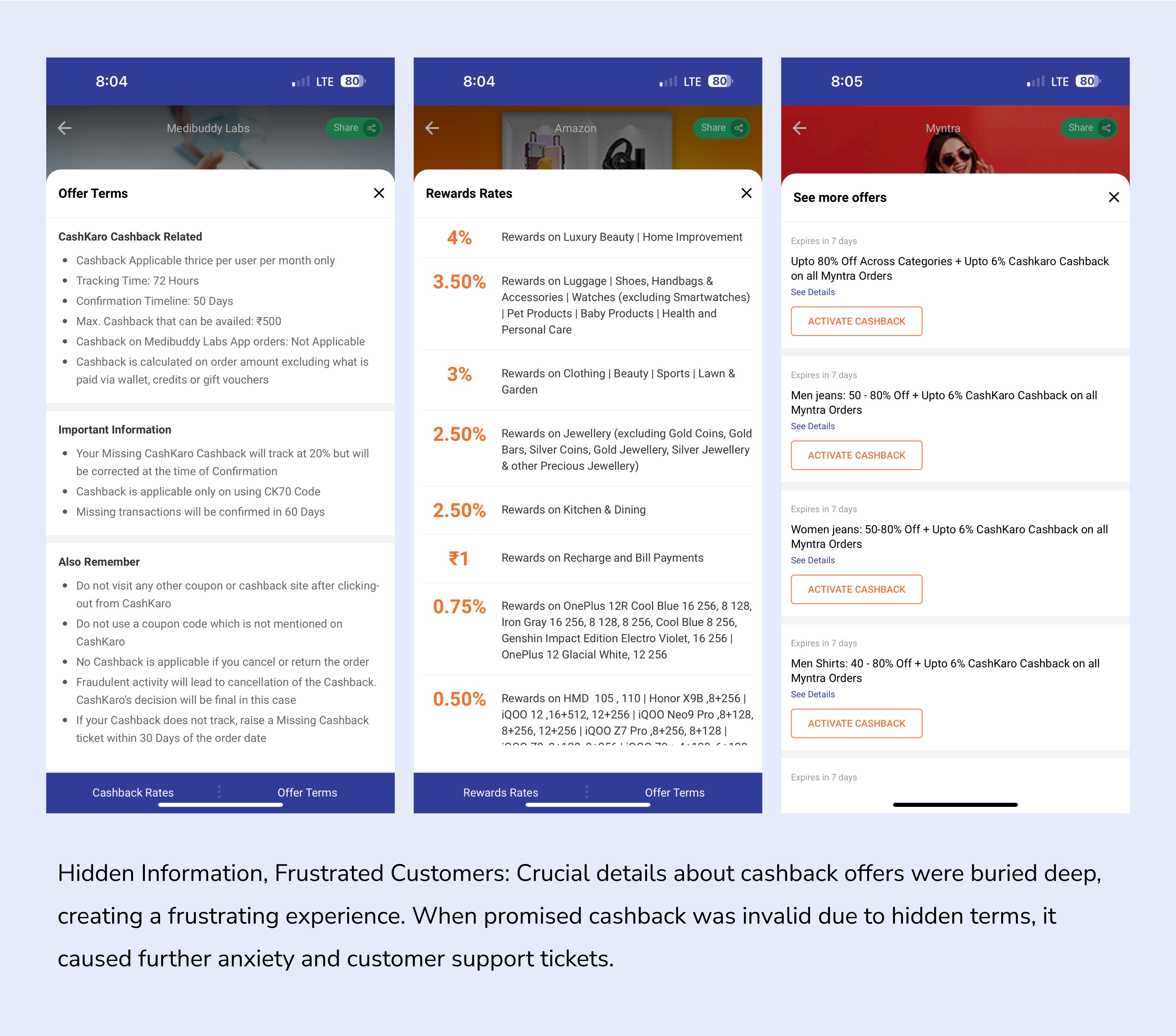
Imagine this: you're excited about getting some cashback from an online store. You click through, but the key details about how to earn that cash back—things like offer terms, rates—are buried or unclear. You assume you've done everything right, but when the cash back doesn't appear, frustration sets in.
This is what was happening with our users. Critical information was scattered or skipped entirely, leading to confusion. Many users didn’t fully understand the steps required to claim their cashback, resulting in lower earnings or none at all. It was clear that trust and credibility were taking a hit.
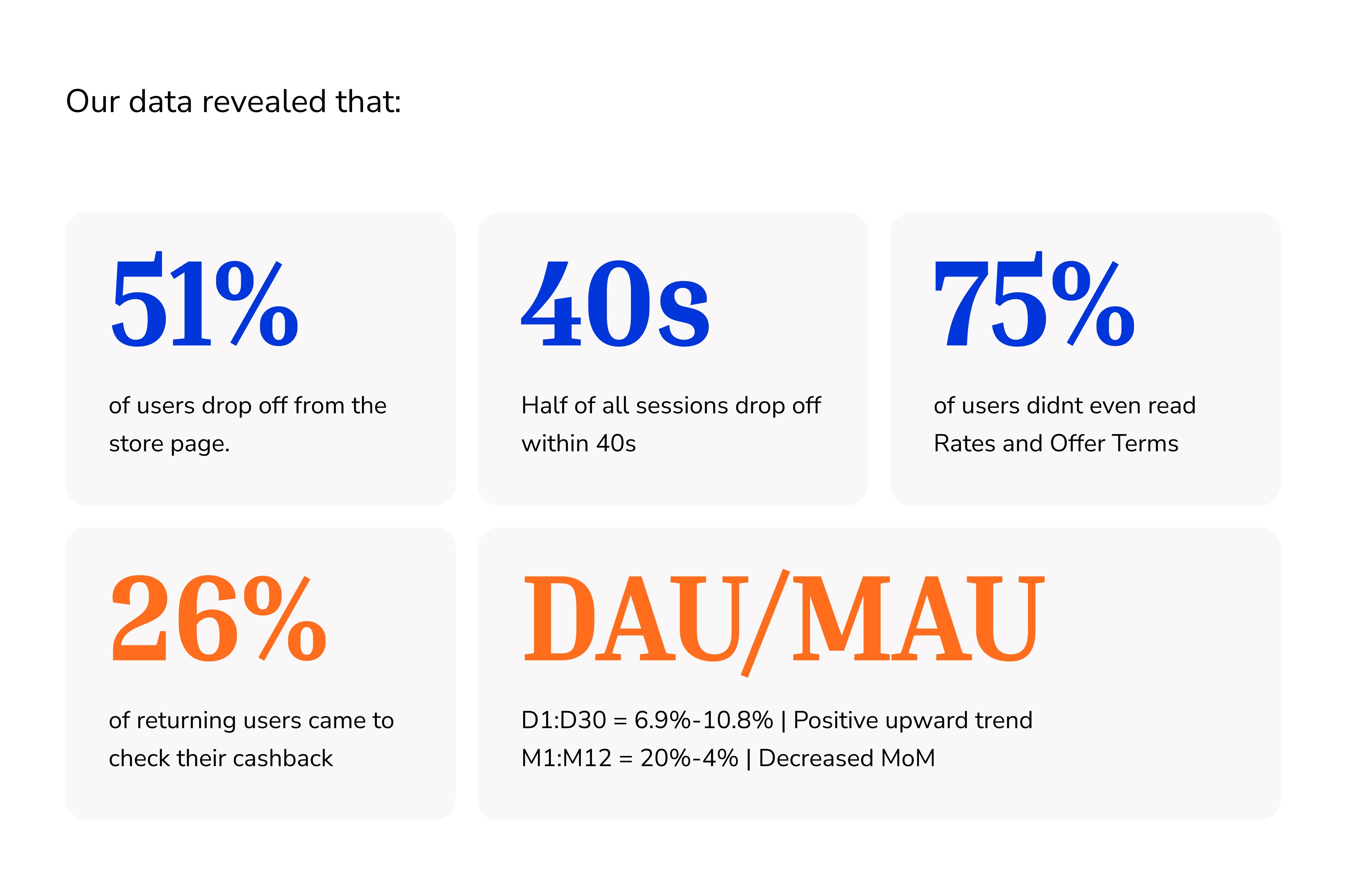
Even more concerning was, users who read the rates and offer terms ended up raising more support tickets than those who didn’t.
The Challenge
As the marketing and promo teams pushed for more space on the app to showcase their ever-growing list of offers, the problem became clear—there was no structure. They wanted to display increasingly complex promotions, filling the screen with details that would be overwhelming for any user to comprehend. The pressure to fit more information into an already cluttered space grew, but it lacked any user-friendly design.
Meanwhile, the product team wasn’t sure how to handle the store page. It wasn’t even on the roadmap, leaving no clear direction on how to improve the experience. With no structured plan in place, the store’s usability continued to suffer.
Despite this, senior leadership seemed to overlook the disruption it was causing. The lack of focus on user discovery and engagement wasn’t a priority, and the real issue—how the confusion and complexity were eroding credibility and trust—was left unaddressed.
Assembling the pieces
The project began without a defined roadmap for the store experience. To gain a deeper understanding of customer pain points and existing user feedback., I partnered with our customer experience director.
Early Insights from data
My team tested the existing CashKaro app to study the most common pain points in the purchase journey. Our goals were to understand the challenges users faced pre- and post-purchase.
The Discovery
Shoppers’ expectations changed over time
The initial findings were shocking. Fundamental issues that should have been addressed from the outset were glaringly apparent. It became clear that users were craving more than just a simple redirect to merchant sites. As CashKaro integrated deeper into their lives, the expectation shifted to a platform that provided clear visibility into the transaction process.
I knew we had to strip everything down to its absolute fundamental blocks. I asked myself, if the store didn’t exist, would I build it the same way?
User experience gaps revealed opportunities to perfect the store experience for discovery, engagement, and user delight. This was the moment we realised we wanted to take a first-principle thinking approach. We knew we had to strip everything down to its absolute fundamental blocks.
We asked ourselves, if the store didn’t exist, would we build it the same way?
The Approach
To address these issues, I gained leadership approval to step back and re-evaluate the store's overall direction.
Define what success meant for us
My initial focus was on understanding why users weren't converting. I defined what success meant for us and to measure it, I established these three key metrics:
Increasing purchase completion rate (currently at 17%),
Decreasing the time to second purchase (currently 25 days),
And improving the conversion rate from store page visits to exit (currently a dismal 9%).
Define our ambition
We aimed to do more than just improve existing metrics; we wanted to redefine what shopping meant for our customers. The goal was to create a personalized, engaging experience that not only drove purchases but also fostered loyalty.
Our high-level goals were to:
Make it personal for everyone.
Give users the right tools to make informed decisions
Create a platform for deeper engagement.
My Role
As the Director of UX, I spearheaded the comprehensive overhaul of the store's user experience. This included crafting a robust design system, architecting the UI for both app and web platforms, and conducting in-depth user research and usability testing. To inform data-driven decisions, I collaborated with product management to establish key performance indicators and extract relevant data.
Existing customers
Most successful cashback needed additional coordination effort
Digging into some more data revealed another crucial insight into the purchase journey. Almost all transactions involved extra customer support, such as a phone call or raising tickets to track their cashback. This realisation showed the experience was not optimised for a post-purchase state.
The time and energy spent tracking missing cashback had a significant impact on the business and CashKaro’s credibility.
For a cashback app, CashKaro was losing 10L/week for fulfilling its core promise. Finding multiple products and calculating their combined potential cashback was much worse.
Reframing the problem
Poorly built store caused closing the purchase loop worry-free
A Flawed Purchase Journey:
Our store's user experience (UX) created a major roadblock in the customer journey – the purchase loop. This loop, ideally smooth and seamless, should guide users from browsing products to a worry-free checkout. However, our poorly designed store fractured this loop at multiple points, causing frustration and user drop-off. Some of the key issues are
Our flawed UX design not only discouraged sales but also eroded customer trust. By prioritizing clear communication, a user-friendly layout, and easily accessible offer information, we aimed to rebuild a smooth purchase loop that will foster customer satisfaction.
This begged the question how might we help shoppers to find what they are looking for and complete the cashback loop efficiently.
The shop redesign
Introducing a 3-stage experience
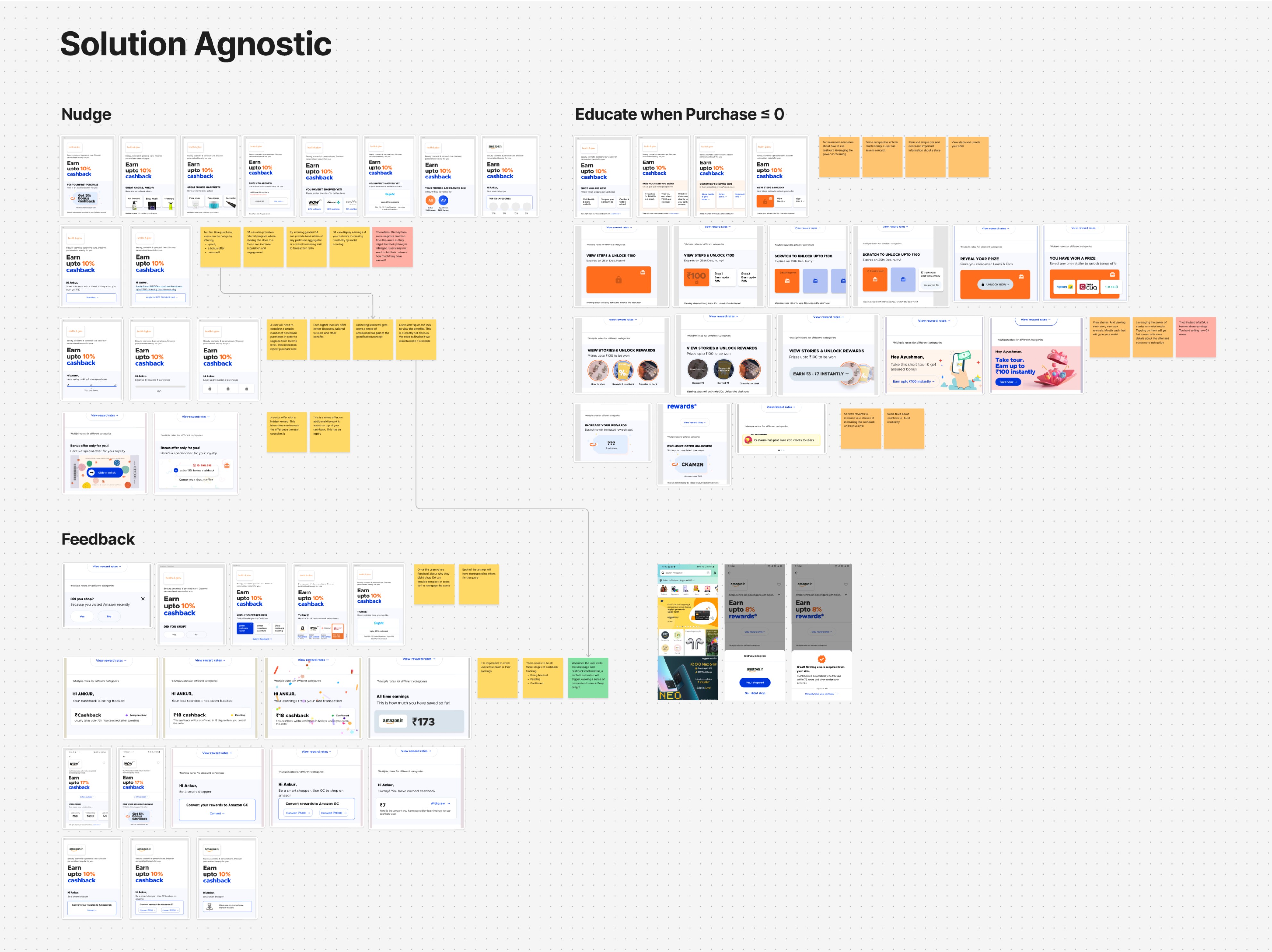
CK streamlines your shopping journey, helping you make smarter decisions effortlessly. Cashkaro adapts to your individual needs, surfacing the best deals and relevant information at every stage of your purchase journey. It also guides you through the entire process, keeping you informed with clear and actionable insights to eliminate anxiety and information overload.
Nudge
Educate
Feedback
S0 D1→S1 D15 Journey
How we got there
Strip everything down to its absolute fundamental blocks.
Three primary questions informed my design strategy:
What are the fundamental needs of our users?
What all intent need to be considered?
How users shop elsewhere?
To effectively design the shopping experience, it was important to study how people shop online and map out their journeys. We focused on understanding what makes people buy and what information they need at every stage of theuir journeys. This involved outlining various shopping paths and categorising users based on their purchase intent – those actively seeking products versus those just exploring the app (high vs low intent).
A comprehensive approach
The existing CK app was poorly designed. It lacked product and offer discovery, no user engagement, and hard to find products. For users who were coming back to the app to check their promised cashback the experience was a nightmare. To solve this, I was parallely leading ‘product discovery’ project on the home page and solving ‘missing cashback’ issues with yet another project, anticipating—all touchpoints will work towards a better experience for the users.
Understanding what users’ needs and intent are
A major reason first-time users dropped off was because finding the right product and offers required them to rely heavily on CashKaro’s homepage. The store wasn't built to support additional or hero offers of the same brand or similar brands, so the user by default dropped off and headed back to homepage for more offers.
Starting from ground up, there were four key design challenges that emerged:
How might we better understand what our users needs are?
How might we increase the discoverability of brands/better deals with minimum effort and time?
How might we make a connect between a purchase and cashback?
How might we better adapt to the dynamic nature of users’ intent?
In order to optimize the shopping experience, there was only one thing we needed to know—the user intent.
We knew we only had 40s of users attention to decide whether user will stay or exit the page and the scroll percentage was also not great, it was non existent. We wanted to utilise the first fold for solving challenges above. We also wanted to utilise the space for promoting CashKaro’s value proposition. I felt that we have been doing a really pathetic job in building the brand, trust and credibility in the current app.
That led us to design and occupy restrain our key information to 70% of the screen’s real state that we had—this way we would cover smaller phones as well. Anything below 70% was upto the user to scroll and explore if they wished so.
Based on the challenges and insights mentioned above, I proposed an dynamic adaptive framework: Nudge, Educate & Feedback to help users guide through the entire journey. Core to the features, were these key ideas—Product intelligence, Intent recognition, and Reward to award
We knew from missing cashback data that 26% of returning users came to check their cashback. Leveraging this hook that to keep the user engaged by providing product discovery assets such as cross sell, upsell etc, and leveraging content strategy. Each of these assets corresponded to the three stages dynamic framework nudge, educate and feedback based on product intelligence
We were concerned about increase in visit:exit click ratio since we were essentially introducing friction but to achieve target activation numbers we were willing to take that risk.
In order to validate our hypothesis, we conducted guerilla and usability testing in several places and offices. To our surprise not a single participant had difficulty understanding the sequence. confirming our intuition for something something
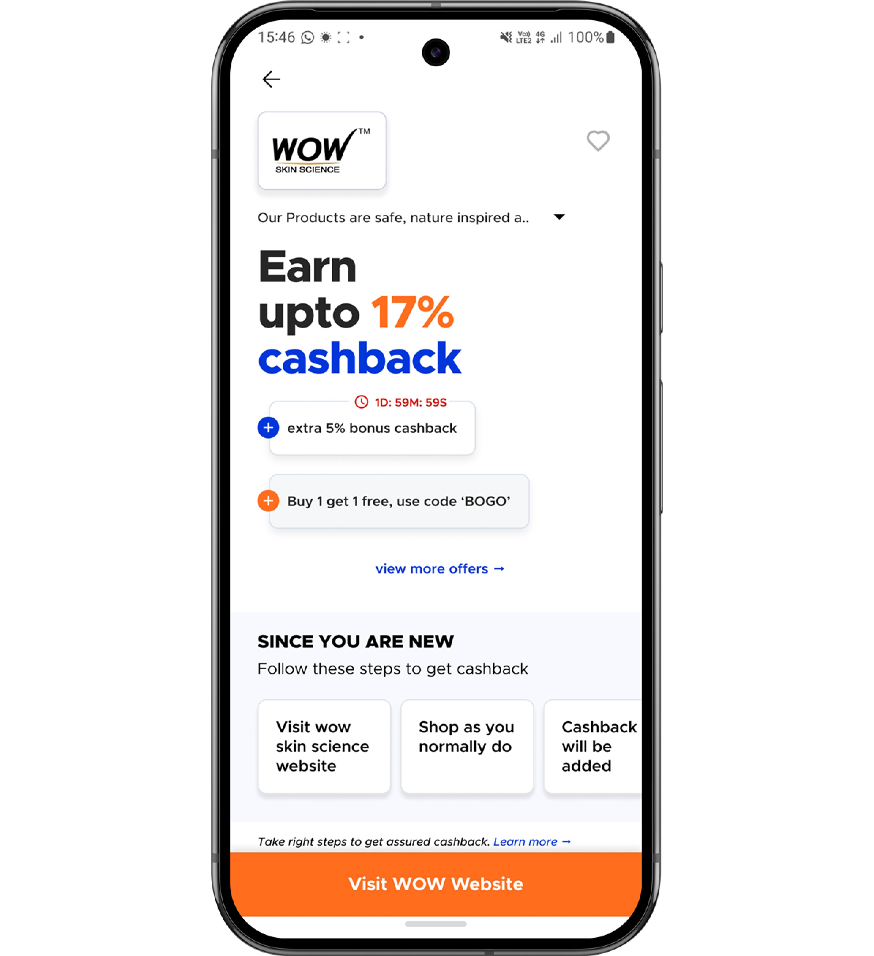
Offers module
We knew we had just 40 seconds of a user’s attention, and we had to make every bit of it count.
The idea for the offers module came from understanding the needs of our marketing and promo teams. They were looking for a better way to organize their various offers without overwhelming users.
As we dug into the existing setup, we noticed some key issues. The upsell and hero offers kept swapping places without a consistent structure. The countdown timers were hogging screen space and drawing attention away from the main offers. Plus, there wasn’t a clear format to highlight the benefits of any given offer, and importantly CashKaro's key selling point—value for money—wasn’t shining through.
Instead of crowding everything up front, we decided to tuck the offers under a secondary layer, creating a dedicated space for all the hidden deals. This decision wasn’t just a design tweak—it involved a backend overhaul and, most importantly, a shift in how users would interact with the offers.
The real challenge here was changing user behavior. People were used to seeing offers right away, so asking them to take an extra step required careful thought.
We knew we had just 40 seconds of a user’s attention, and we had to make every bit of it count. Since the first fold was our prime real estate, we used a chunking method to break things down into manageable pieces. After exploring a bunch of options, we landed on a design that was both clean and efficient, addressing all these issues while making the best use of the available space.
Inspiring confidence on the dynamic asset
An important design challenge was to understand how many users were actually completing their purchases.
The offer module was a key touchpoint for the user but the most important touch point had to be the dynamic asset. An important design challenge was to understand how many users were actually completing their purchases. We often saw multiple in-app browser sessions for new users that didn’t necessarily translated into a successful purchase. Considering the fact that all successful purchases have a confirmation period, the dynamic asset needed to adapt intelligently, staying relevant and avoiding redundancy. It had to show key information based on where the user was in their journey.
Giving users more value for their time Knowing the users intent and the understanding of their purchase journey allowed us to do the heavy lifting and present the more optimal information upfront. The system needed to be smart enough to just work when it could, and humble enough to intervene when it couldn't.
To make the store more efficient, we knew we had to go beyond just listing offers. The goal was to give users all the relevant information they needed to make informed choices. Everything we did was focused on their needs and benefits.
By analyzing path data and shopping behavior, we identified key product assets that could boost the experience, such as creating benefit-oriented stories curated by CashKaro.
One of our main goals was to cut down on the number of cashback-related queries. We knew from customer calls that users often had questions about how cashback worked, and the key was to reinforce that information until it became second nature for them.
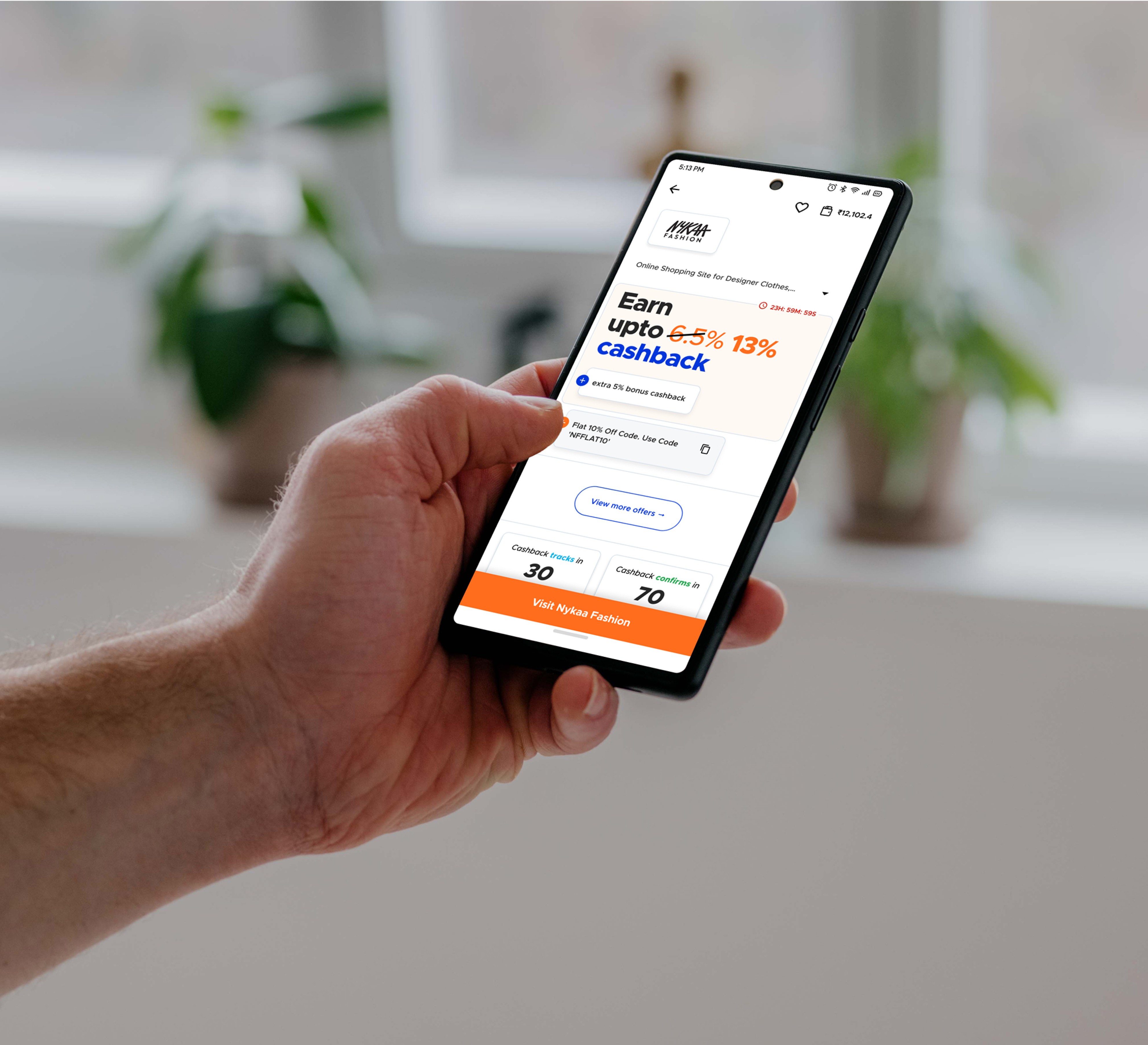
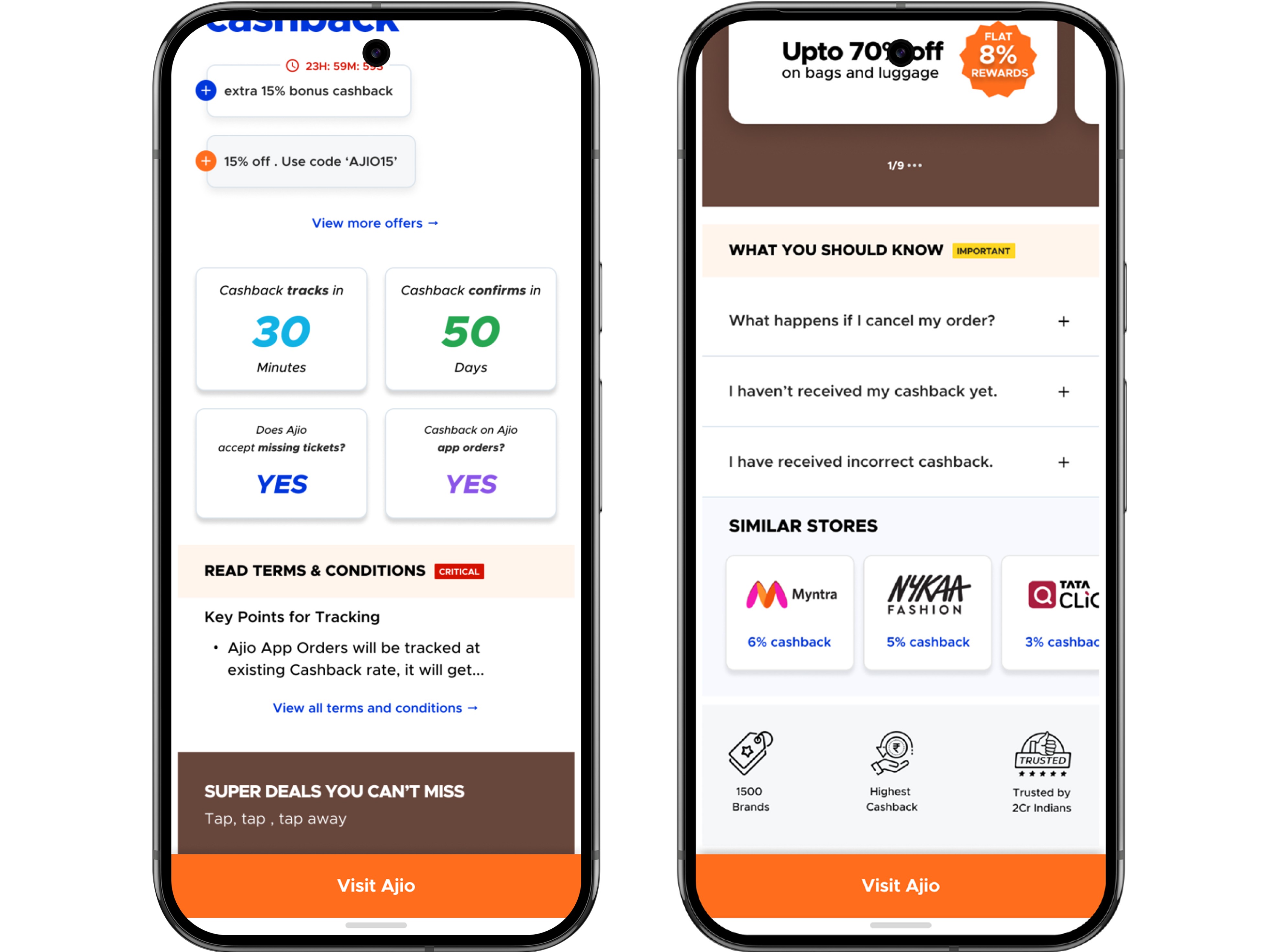
We started by putting cashback tracking data front and center, making it super easy to understand. But during testing, we realized users wanted even more details, so we made the data tapable for quick access. We also added quick T&Cs and FAQs with the most common queries directly on the store page, helping to reduce missing cashback tickets and boost our satisfaction scores.
Another riskier design decision I made was to inculcate the terms and conditions during the core flow
The idea was to make that information very contextual and relevant as and when the user needed it to persuade users to focus on the key terms so they dont miss out on the promised cashback.
This meant the UX needed to bring in friction during the checkout flow which is always a risky move. at the same time instill confidence for the majority and those who wanted to assert control needed to know the terms and conditions
From Ambiguous to Obvious
They had fulfilled their end of the deal, yet CashKaro wasn’t delivering.
A key part of the store experience is ensuring that users have a clear view of their earnings and past purchases. The existing CashKaro app wasn’t doing enough to support this, relying heavily on an overly complicated and mostly confusing earnings tab.
During our research, we uncovered several challenges related to cashback and earnings. Users struggled with recent clicks, raising tickets, and distinguishing between rewards and earnings—it was a common source of confusion.
It became clear that users were facing a lot more frustration than they should have, struggling just to find the cashback they were promised. They had fulfilled their end of the deal, yet CashKaro wasn’t delivering, leaving them to deal with the confusion and hassle. It wasn’t just a minor inconvenience—it was a significant failure on our part, creating unnecessary friction and eroding their trust.
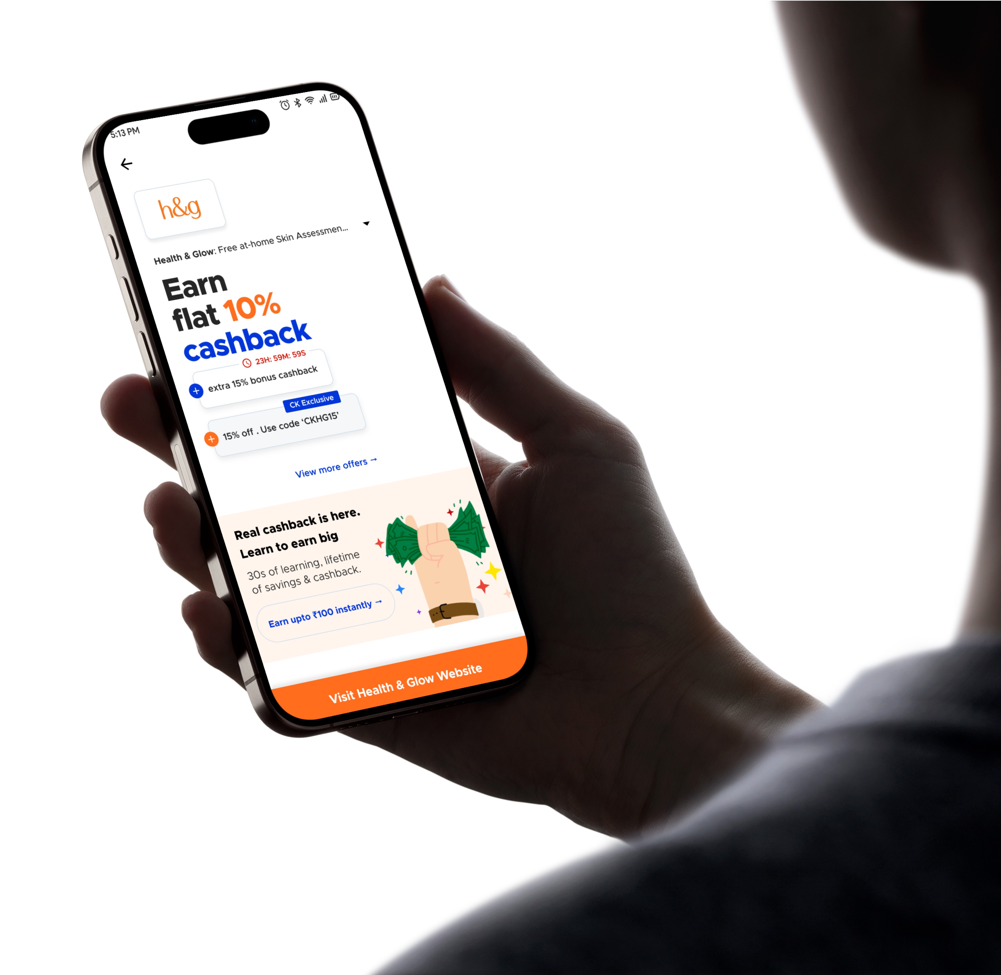
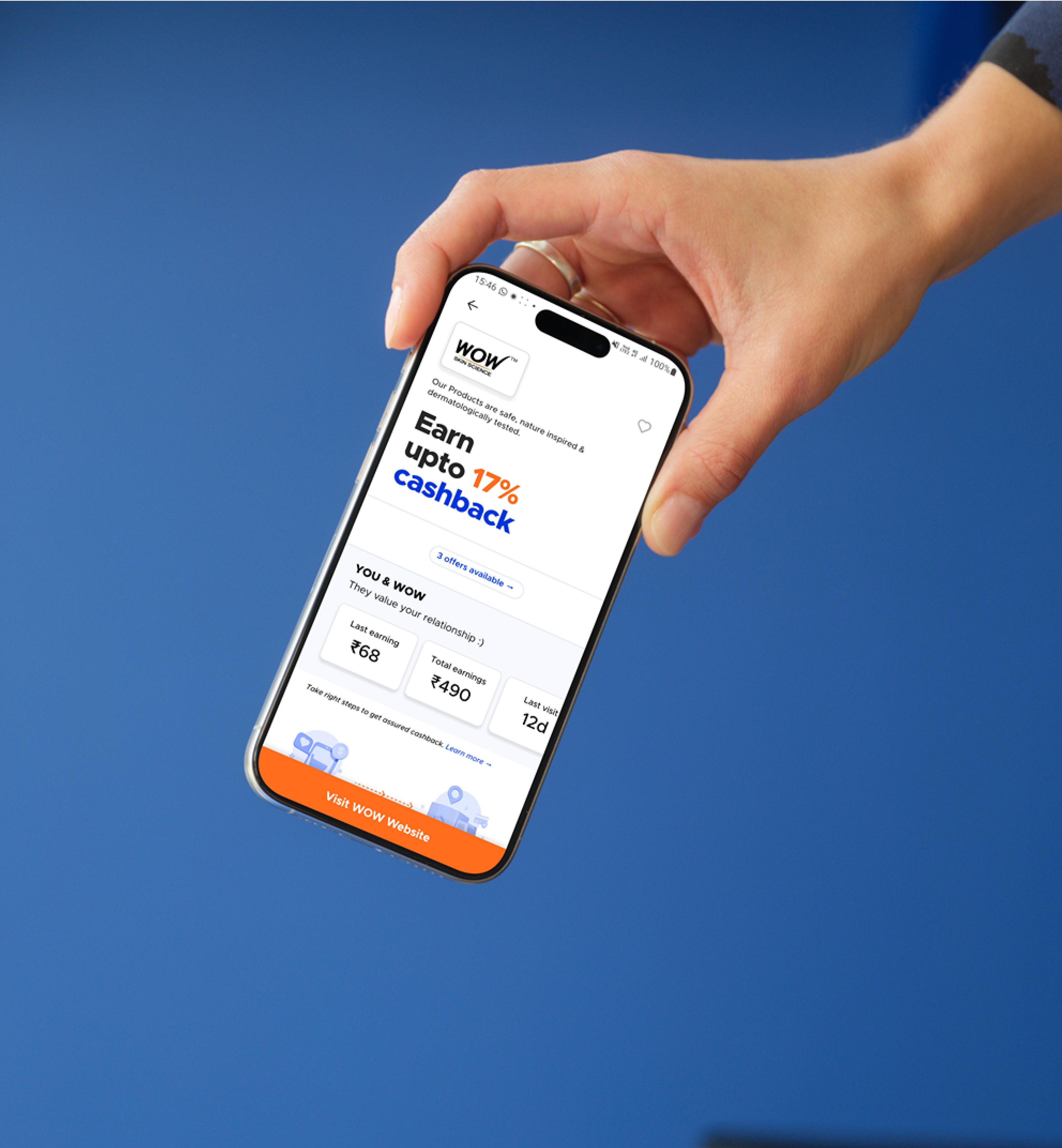
We introduced the earnings feature directly on the store page—a framework designed to reflect a user’s relationship with a particular brand. It works by analyzing past purchases to present more relevant offers and products, displaying both recent and overall earnings by pulling data from the backend.
The larger vision was to create a system that encouraged users to withdraw their cashback or convert their rewards into gift coupons, ensuring that the CashKaro journey ended with that final "aha" moment. The true measure of success for the project was when users could finally experience the satisfaction of real cashback hitting their bank accounts—without that, the journey felt incomplete.
The Launch & Impact
It is great to know that the new CK Store is scheduled to launch in December 2024.
In the 6 months where I was exclusively working on store, I also started redefining other user journeys and pulled my team to evolve and polish the visual design for the desktop. It is great to know that the new CK Store is scheduled to launch in December 2024.
Some of the key parts from the new designs (cashback tracking info, similar stores and cashback rates) are already a part of the current app.
All rights reserved
shadmanahmed.com


