It was 2 a.m., and the night wrapped around them like a suffocating blanket. John’s eyes flicked nervously between the glowing phone screen and the empty, dimly lit street. His two-year-old daughter, finally asleep after a long day, stirred in her car seat. Google Maps had insisted they had arrived, but there was no Zoomcar parking in sight. Just an eerie silence.
His wife looked at him, her face illuminated by the dashboard lights, worry etched in every line. "What do we do now?" she asked, her voice barely above a whisper.
John clenched the steering wheel, trying to keep calm. "I’ll figure it out," he muttered, though even he wasn’t sure what to do next.
Minutes stretched into an agonizing hour as they circled around, searching for any sign of the Zoomcar lot.
Nothing. No response from customer service. His phone battery hovered dangerously low, much like his hope.
“We’re going to miss our flight,” his wife said, breaking the heavy silence. The words hung in the air, choking him. They still had a two-hour drive to the airport—if they could even find the car. His mind raced. How much would they be charged if they missed the return? How would they explain this to the airline, or worse, their exhausted child?
His daughter stirred again, starting to cry. The dream of a perfect family trip now felt like a cruel joke. This was supposed to be the moment they’d remember forever—adventuring through South India, creating memories. But now, all he felt was dread.
Regret washed over him in waves. Why had he booked this car? Why hadn’t he seen this coming? The flight they were so close to missing wasn’t just a departure—it was their escape from this nightmare. And time, merciless and unrelenting, was running out.
The decision to rethink TripBuddy didn’t start with a new feature request or a product roadmap update—it started with a frustrated user—a regular Zoomcar user who missed their flight because of this mis-info (read no info). Something so small, yet it had a ripple effect. We realized then that design isn’t just about making things work; it’s about creating moments where people felt understood. That user wasn’t just interacting with an app; they were trying to navigate their life, and that’s where we stepped in.
TripBuddy — Redefining the Zoomcar Journey
TripBuddy is that phase of the app experience which begins once the user has booked a car.
Zoomcar is an Indian self-drive car rental service that allows users to book vehicles for short or long-term use. Founded in 2013, Zoomcar revolutionized car rental industry in India by providing a convenient, hassle-free alternative to chauffeur-driven rentals. It catered to various users needs such as family road trips, business travel, or just a day out in the city.
TripBuddy is the phase of the app experience that begins once the user has booked a car, whether through desktop or mobile, and continues through their entire journey—starting from the moment they are ready to hit the road until they return the car and settle the payment.
The Problem
Over 33% of Zoomcar bookings required users to call support for various information, leading to substantial customer service costs.
As users navigate Zoomcar’s customer journey, they need access to a range of contextual information at various stages of their trip. However, our initial analysis revealed that the delivery of this information was disjointed and inconsistent, resulting in a broken user experience. Due to this fragmentation, over 33% of bookings led to users calling customer support for information regarding their bookings.
The directive was clear—find a way to reduce the expense associated with inbound support calls.
The Challenge
Zoomcar’s Trip Buddy wasn’t about adding another layer to the app—it was about reimagining how users engaged with their entire travel experience. The problem wasn’t simply functionality; it was emotional. Users were often confused, overwhelmed, or felt lost during key moments in their journey. And those moments—however brief—made the entire experience feel fragmented.
We were tasked with bridging that gap. Our goal wasn’t just to address pain points; it was to make the experience felt like it knew the user, guiding them at every turn, seamlessly.
Our high level goals were
Make Trip Buddy a companion rather than just another tool.
Create a platform for innovation and deeper engagement.
Reduce ambiguity around contextual data users need.
Reduce number of distressed user calls to support
Assembling the pieces
The first step I took was to look at the current user journey for our users, what happens at each of these stages and what pain points we currently know.
Early insights from research
We started with understanding how users think and feel during critical moments in their journey—before, during, and after they got behind the wheel. We also studied their driving behavior, pickup & drop offs and payments, mapping out where frustration set in and where satisfaction peaked. The insights were striking.
Users didn’t need more features—they needed clarity.
Discovery
Users didn’t need more features—they needed clarity. They didn’t want an overload of information, but rather subtle nudges at the right time. So, instead of complicating the interface, we focused on making it as intuitive as possible, with Trip Buddy guiding users like a friend, anticipating needs before they arose.
Users wanted a seamless way to stay informed, make changes, and handle unforeseen circumstances without stress. But in reality, they were left feeling overwhelmed—having to juggle last-minute changes, navigational issues, and coordination problems without the right tools to guide them.
The Approach
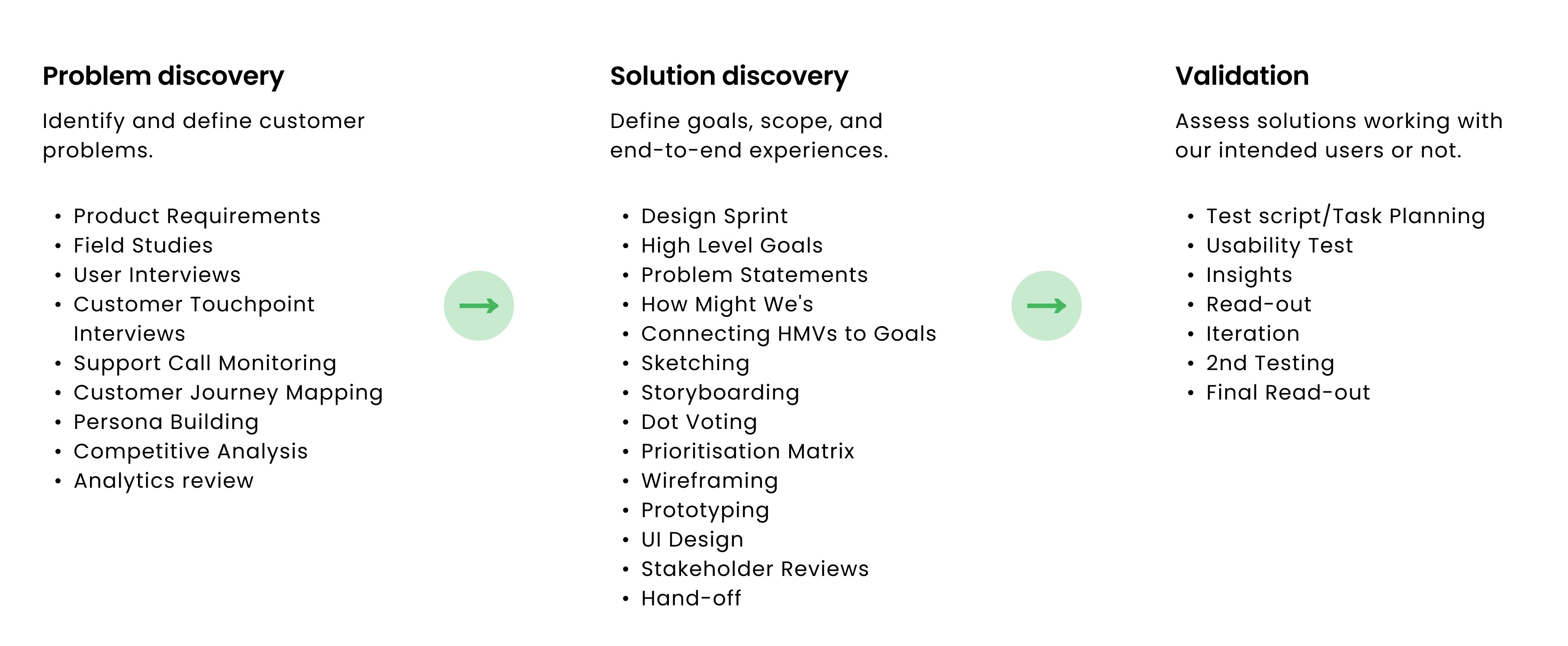
In uncovering the problem, my first step was to get clear on the actual issues users faced. I began by gathering product requirements from primary research—starting with a deep dive into call monitoring—and from there, I planned and led nine UX activities to thoroughly investigate.
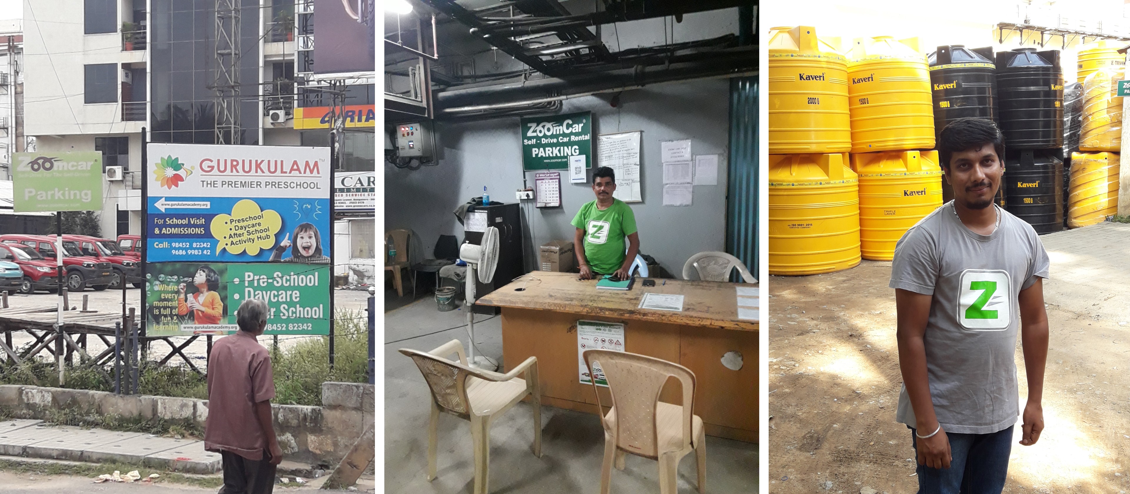
Field studies were up first. We covered 20 pickup points across five cities, including both Tier 1 and Tier 2 areas. This wasn’t just about mapping locations; we observed the ease and challenges users faced reaching these points, both day and night. We watched users in real time as they picked up and dropped off their cars, documenting everything from the time they spent navigating these spaces to how they interacted with the service.
We also held interviews right at these sites. The on-ground fleet teams, who handled pickups and drop-offs, became an invaluable source of insights—they offered a unique perspective on frequent issues, last-minute changes, and unexpected user behavior that often went unreported.
To dig deeper, I conducted additional user interviews—sometimes over calls, other times inviting them into our office. Each conversation uncovered new angles and complexities of their journey. In tandem, I monitored over 50 support calls, stepping in to answer 15 of them with an executive by my side. Listening to users’ immediate concerns brought a raw, firsthand understanding of their frustrations and questions.
Once the insights were gathered, I transformed them into a customer journey map, tracing users’ emotional highs and lows at each stage of their trip. Finally, before diving into solution discovery, I did a competitive analysis and reviewed analytics data, ensuring that every angle was covered before defining our next steps forward.
My Role
My role for this large project was divided into three phases:
1. Problem Discovery (Where we uncovered multiple user pain points),
2. Solution Discovery (Where I created the end-to-end user experience),
3. Validation Phase (Where I tested, iterated & tracked metrics to validate solutions)
Existing Zoomcar sites
Most dedicated Zoomcar sites needed additional coordination effort, imagine a pick-up without it
We were working parallely to create a different model, more sustainable. The zoomcar picking experience was bound to be affected. So whatever solution we come up with needed to be scalable.
Currently Zoomcar owned roughly about 3000 fleet and approx 10-15 dedicated pick-up sites/city. But with ZAP model, there would be no dedicated pickup points anymore. That would add to the ongoing pickup problems for users by 10x
Most dedicated Zoomcar sites needed additional coordination effort from fleet. The new ZAP model would remove the need to have a dedicated space and the cars will be pickedup from various addresses throughout the city.
Reframing the problem
Lack of information was causing disruption in users overall trip experience.
The Zoomcar experience was riddled with issues: inaccurate location details, missing critical information, and inefficient fuel and payment settlement processes. Instead of enjoying their well-deserved vacation, users found themselves stressed over Zoomcar’s processes, often needing to repeatedly call support to resolve payment issues. This constant back-and-forth left users frustrated and mentally drained, overshadowing what should have been cherished memories of their recent trip
Our philosophy—Never Stop Living
It wasn’t just about building another feature for zoomcar; it was about changing how people felt about their journeys. Most apps had the basics down—booking, riding, paying—but we wanted to craft something memorable. Something that would make users walk away from their trip feeling like they experienced more than just a ride. What could we do differently? How could we tap into their emotions?
This begged the question how might we reduce users anxiety and help them feel supported throughout the process?
The booking experience redesign
Introducing Trip Buddy
In the crowded world of ride-sharing apps, there’s no shortage of features that promise convenience and efficiency. But at the core of it, people just want to get from Point A to Point B, right? Wrong.
TripBuddy empowered users to fully enjoy their trips, free from worry. It delivered timely, relevant information right when they needed it, creating a seamless experience that felt attuned to their needs. By enhancing user engagement, TripBuddy also strengthened customer loyalty with Zoomcar.
How we got there
Elevate the experience for all users
Three primary questions informed my design strategy:
How do you solve for all use cases, across different pickup models?
What contexts need to be considered?
What is a perfect booking experience ?
Early on, it was important to understand different factors that may influence the pick-up and drop-off experience. I mapped all the possible concepts and translated this into a framework.
The turning point: A key insight
We remember experiences as a series of snapshots rather than a complete catalogue of events. The most emotionally intense points of an experience and the end of that experience are heavily weighted in how we remember an event.
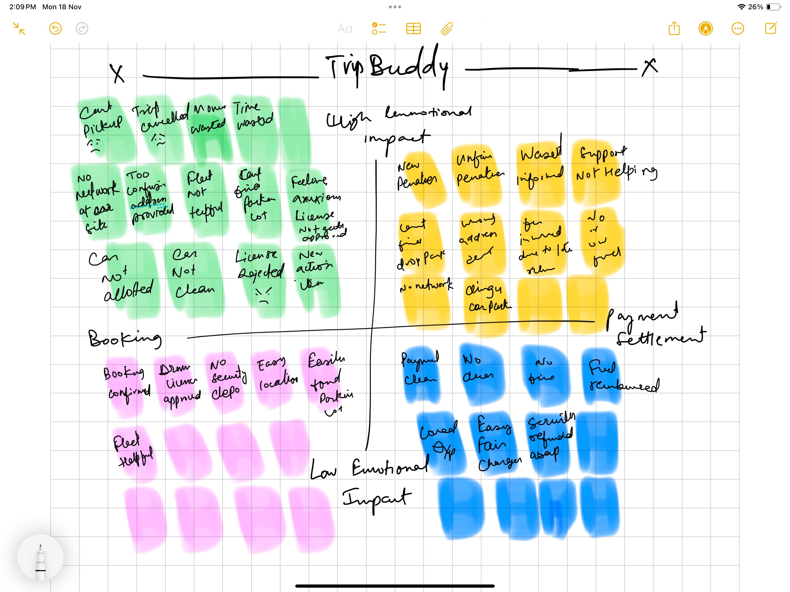
We observed during a) pickup b) drop-off and c) settle stages, there were a lot of pain points that were leading to AAAD (Anxiety, Ambiguity, Anger, and Dissatisfaction) amongst users. By analyzing the extent of emotions (represented by light-colored rings below) helped me in leveraging a cognitive bias called the peak-end rule.
The peak-end rule is a cognitive bias that impacts how people remember past events. Intense positive or negative moments (the "peaks") and the final moments of an experience (the "end") are heavily weighted in our mental calculus.
With this in mind, I recognized that the peak experience might fall outside our control, as the journey’s most intense moments could arise at any point, not just during car pickup. However, I was confident the end experience lay in the drop-off and settle stages, which became the focal point of my solutions.
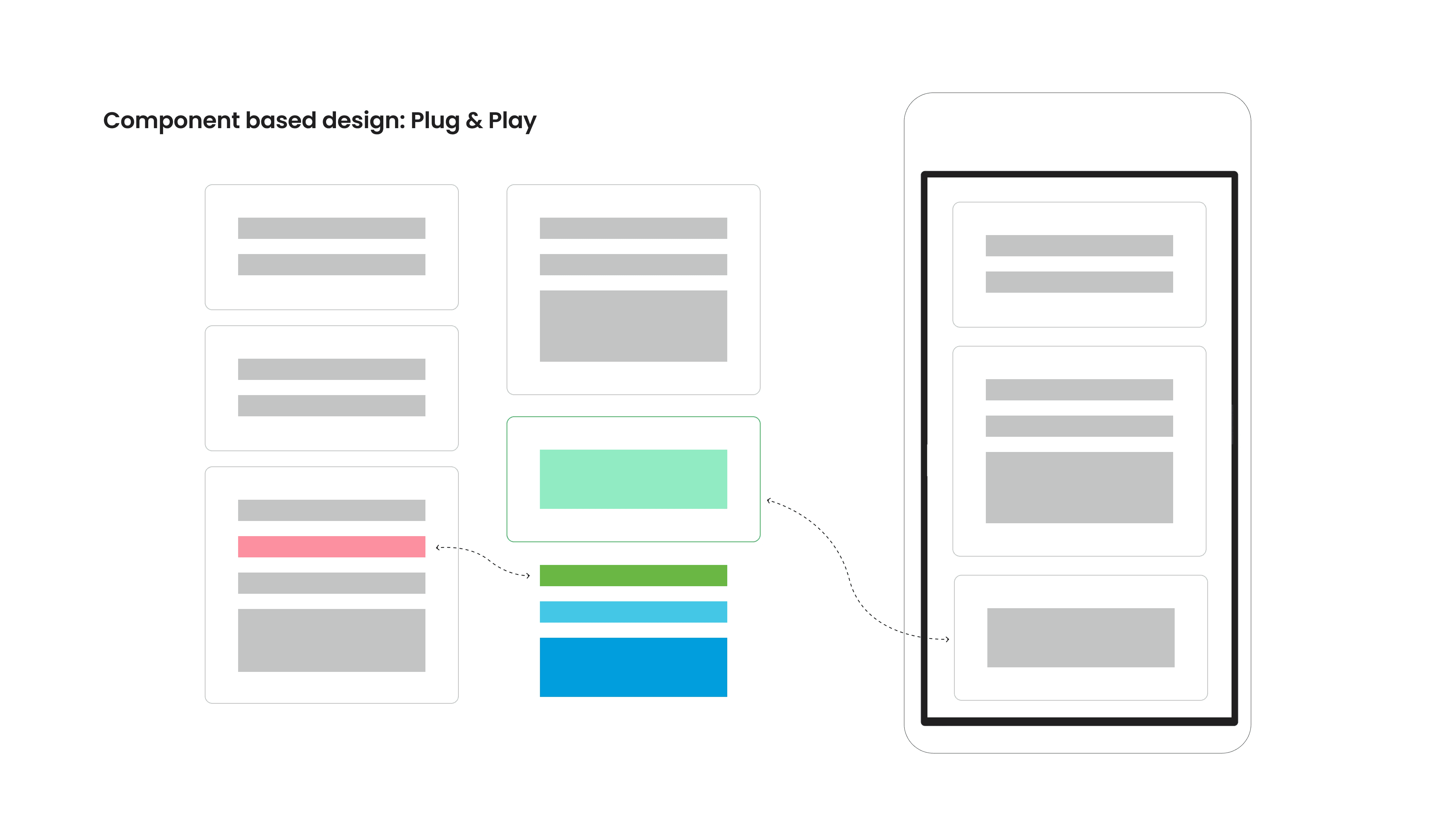
Component-based design: Plug & Play
Before starting the solution phase, it was clear to me that I needed to build the app experience in such a way that:
a) it is easily scalable,
b) the contextual info can be added or replaced as and when required, and
c) each of these data points can be plugged in by the back-end when it's called.
Working Backwards from Payment Settlement
I reversed the polarity of the imperfect pickup to jumpstart creativity. Four key design challenges emerged:
Starting from ground up, there were four key design challenges that emerged:
How might we better show where the drop off/pickup point is?
How might we solve for in-trip challenges that will help users avoid penalties?
How might we make unexpected charges more transparent?
How might we better adapt to the dynamic nature of zoomcar pickup points?
In order to optimize the booking experience, the place we needed to start from—was the end.
Our research revealed that payment settlement invoked the strongest emotional response; however, this response was predominantly negative rather than positive.
Three things we identified that were not acceptable even for us let alone for creating an unforgettable journey.
Users were charged for each time they exceeded the speed limit.
Users were charged for excess kilometers and for late return neither of which had any supporting information in the app.
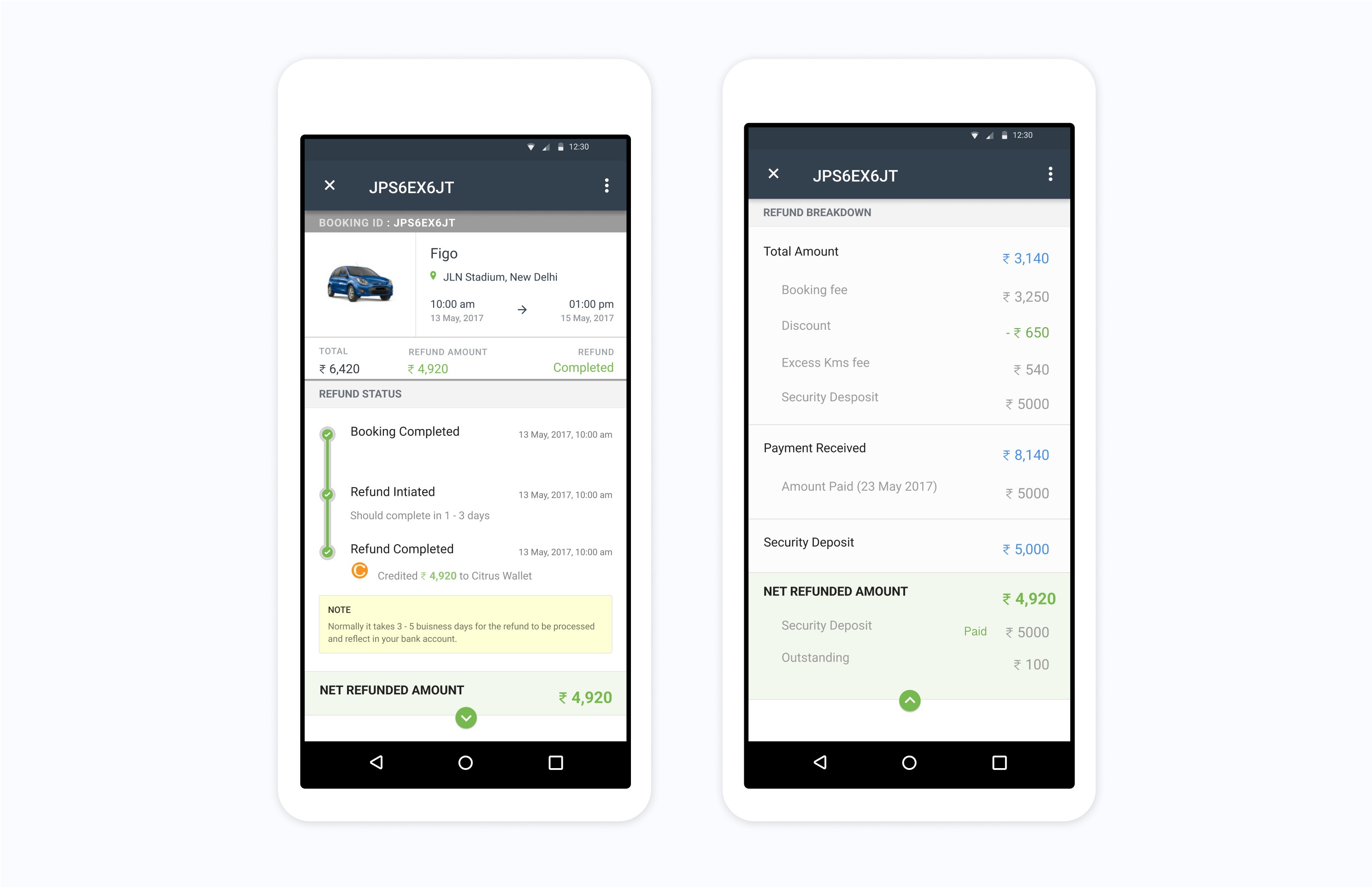
The only way to settle dispute was to call the customer center. The settlement was also not immediate as customer support had to validate the claim before the payout leaving users worried and anxious for days.
What we uncovered shaped the experience
Being a price sensitive market, Indians are extremely emotional when it comes to money
Being a price sensitive market, indians are extremely emotional when it comes to money. Users claim they were being unfairly charged for things they didn't agree with as there was no transparency in the system.
So we had to pushed back on the product to make certain critical changes that had an impact on user's satisfaction and psyche. Changes that we made to enhance the experience included product level changes along with designing new user interface.
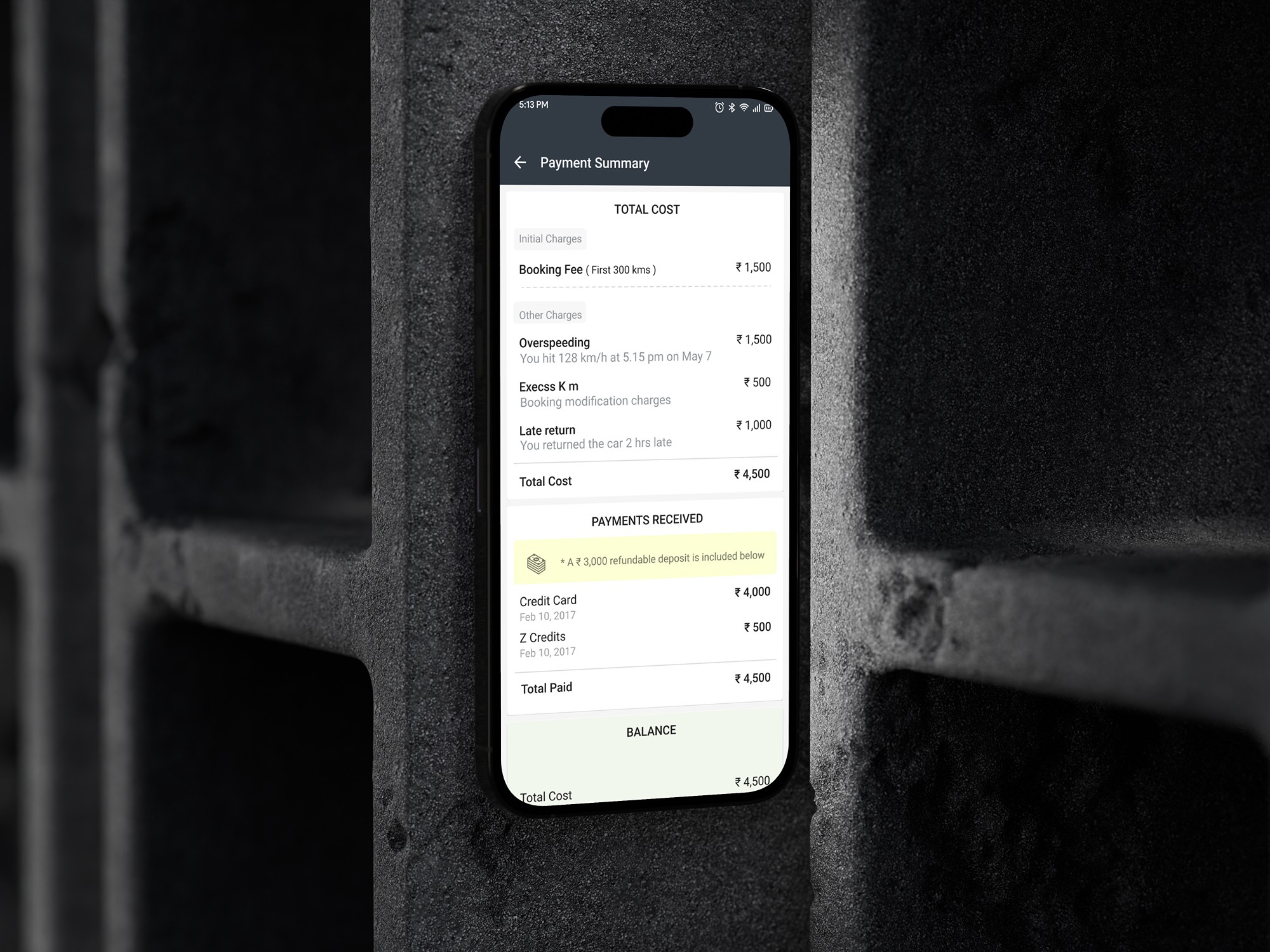
Image of multiple overspeeding charges (from this) → warning, single charge, reduced amount (to this)
First things first since we wanted to reduce the ambiguity in the settle phase, we looked at how we can help users save from this anxiety.
We deduced three critical solutions (based on user interviews and research):
A warning first: Instead of surprising users with fines, we introduced a warning system for overspeeding. This empowered users to self-correct before penalties were applied.
One fine, not many: We noticed users were being fined multiple times for the same issue, which felt unfair. By implementing a system to charge users only once, we simplified the process and reduced frustration.
Fines that feel fair: We realized the existing fine of ₹2500 felt excessive, so we recalibrated it to ₹1500—an amount that balanced accountability with fairness. This change resonated deeply with users, and our NPS score jumped by 12%. At the time, we became the only platform with a more reasonable fine structure.
Together, these decisions were a game-changer. User queries dropped by 23%, and the overall experience became more transparent and user-friendly.
The Zoomcar site experience
We had couple of months before ZAP rollout, till then we were determined to fix the site experience
Dedicated ZC sites came with their own set of unique challenges. While many of these issues required operational solutions—where UX could only provide research insights and wait for operations to address them—there were also user experience problems we identified as opportunities to take immediate action and resolve.
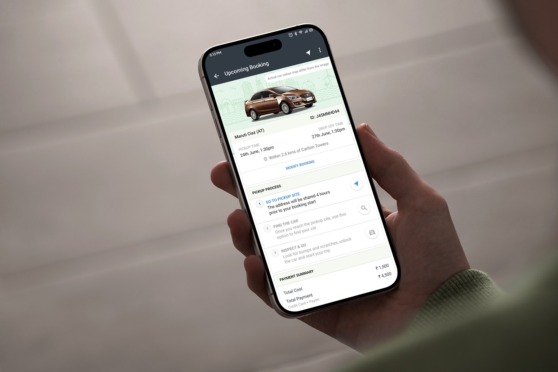
Image of notifications (enlarged) and redirecting them to upcoming bookings page
Though seemed basic but we started with the push notification and redirected the users to upcoming booking page instead of opening the app's landing page as it was currently. That helped bring down the number of calls by 18% which were related to booking time, kms package.
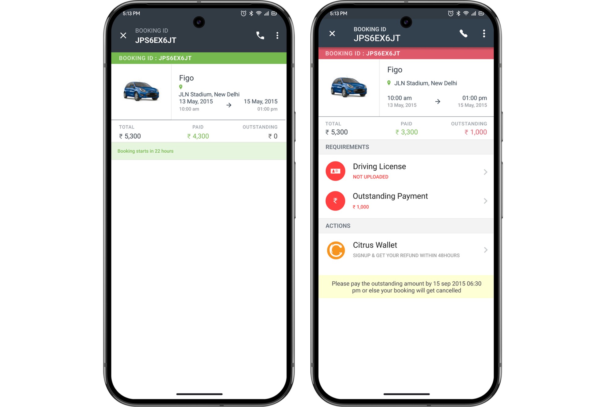
While we were working on the license verification process in another project, we decided to give users transparency about their verification. We updated users constantly with rejection and its causes, bringing the hard copy to pick up the car (mandatory step) and educating users on license criteria.
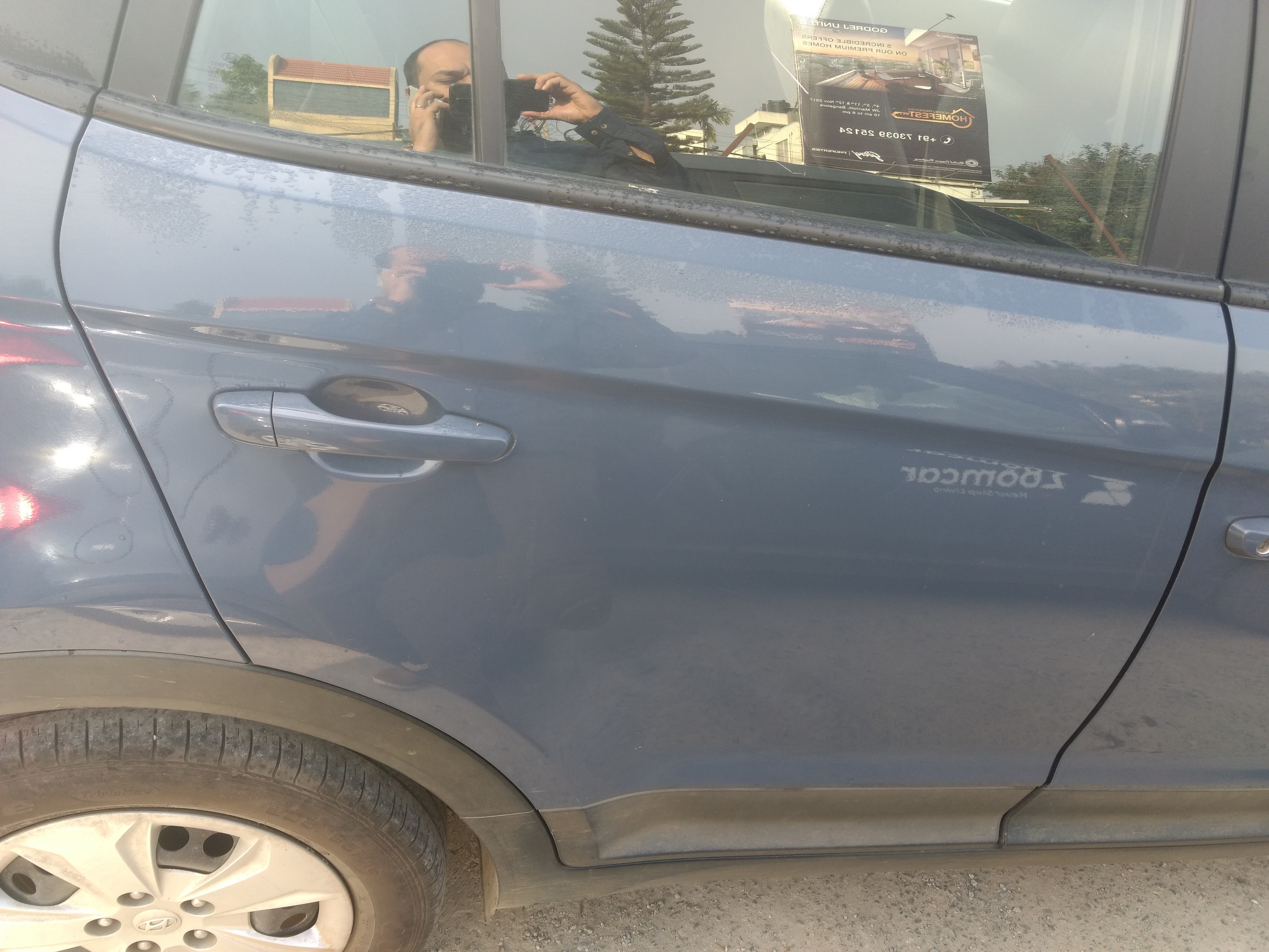
We also addressed another first of its kind feature of updating users with actual car colour and honk your car to find it easily.
It seems pretty basics but these measures were first in 2016 where DL verification, actual car colour and honking and beeping car as a feature hadn't matured in general.
Image of license verification stages
Image of actual car colour, honk your car
Image of car details
From booking to pickup
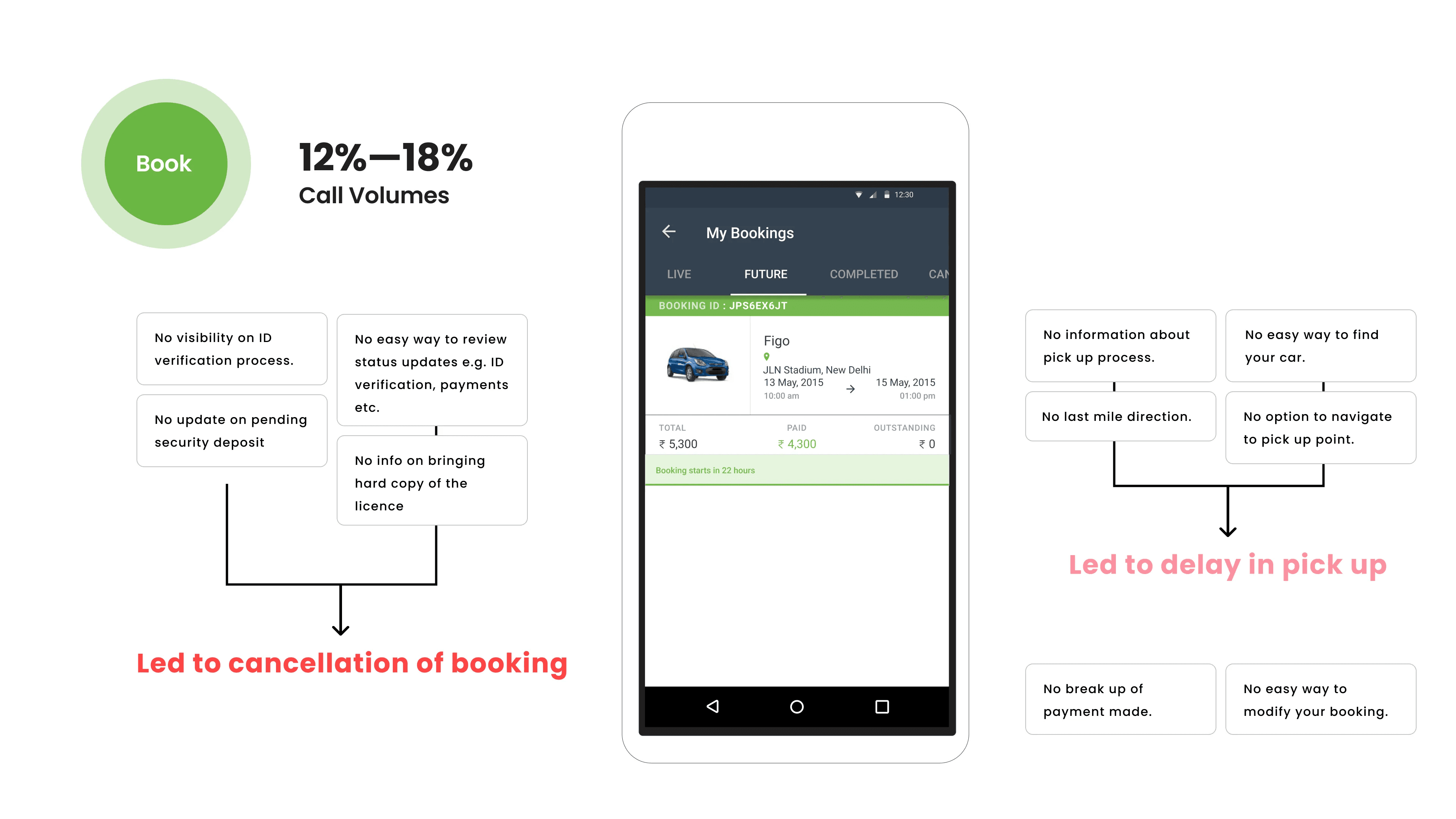
We realized pain points could be bucketed into 'Lead to cancelation' and 'Lead to delayed pick up'.
Once the booking is made, if the user is a first-timer, he must upload his driving license and wait for verification, which was mandatory for picking up the car. We realized that the pain points during booking could be bucketed into those that lead to cancelation and those that lead to delay in picking up.
Let's look at the top 8 pain points that led to the cancellation of a booking or delay in picking up the car.
No visibility on the ID verification process.
No easy way to review status updates or any action that needs to be taken.
No update on the pending security deposit.
Absence of critical information to bring a physical copy of their driving license.
No information about the pickup process.
No easy way to find the car.
No last mile direction.
No option to navigate to the pickup point.
Pickup, Drive, Drop off, and Settle Stages
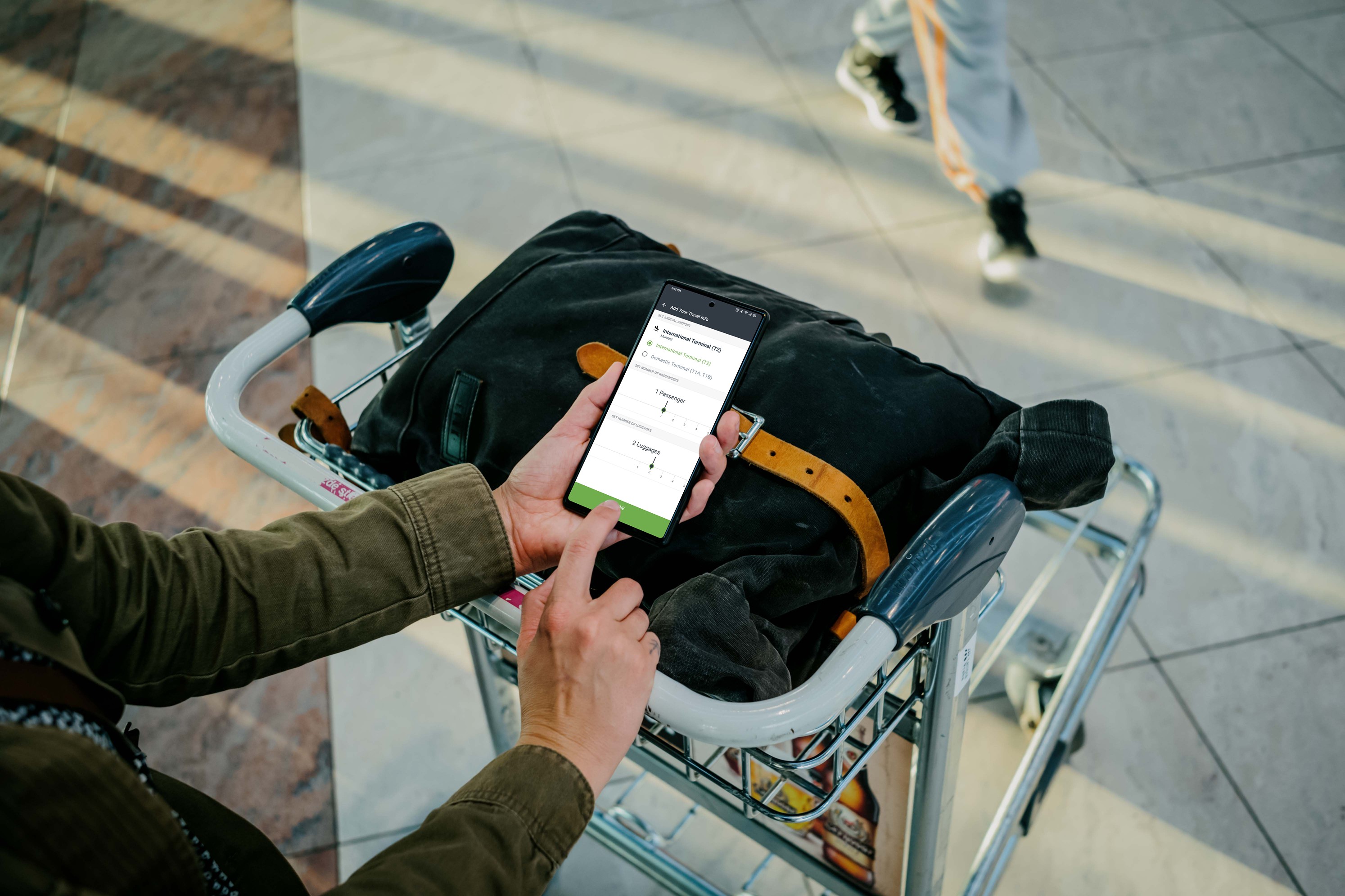
Similarly, in this phase, the interface will remain the same from time n to 4 hours before booking. Once the time check is triggered, new actions appear that the user needs to do. Depending on his pending items, either there will be mandatory actions the user needs to perform or the next steps.
Similarly, we uncovered plenty of pain points for the following three stages for which we had to solve.
First draft: The wireframe and first usability testing.
With the idea we zeroed in during the design sprint, we made our first wireframe draft addressing pain points at each stage. Some of the major points we addressed were:
Push notifications during booking confirmation, soft allocation, and hard allocation of car.
Transparency in the license verification process.
Outstanding payment before pick up.
Over speeding warning and charges.
How pick up and drop off works.
Last-mile directions.
Fuel levels.
Time remaining.
Extend booking.
Transparency in payment and other charges.
Fuel reload assist.
Key Insights: Failures from usability test 1 and iterations
They had fulfilled their end of the deal, yet CashKaro wasn’t delivering.
Though most of the intended design worked well there were some of the design ideas that didn’t work as we intended them to be.
In the first design, once the user taps on the push notification, we redirected them to the trip buddy’s landing screen with a booking details card and a last-mile direction card (how pick up works was also added to this card as a text link).
That didn’t work for four reasons,
a) we didn’t mention the booking ID as that was a primary identification for all booking-related queries.
b) The last mile direction (the pick up) card was confusing to users because there were multiple things for the users to consume.
c) users were not able to see how pick up works text link. This link was completely missed by the users.
d) Modify booking was still getting lost in the interface.
Solution:
We redesigned the layout and brought the pick-up process right up front with the help of a stepper. Each of the tiles represented the next step and was tappable.
2. Users were concerned regarding the exact location of the pick up point and showed confusion with the prototype. Though the exact address will only be shared 4 hours prior to the booking start time, users seemed to overlook this information in the first prototype.
Solution
We also changed the approx location entry point to a full screen to make users know that the exact address will be shared 4 hours to booking.
3. Another insight we got from the test is the structure of the last mile direction. The photos, last 100 meters were all chaotic to the users.
Solution
We changed the last mile into a step in the pick up process(read point 1 above). We also tried with a different but simpler design for the last 100 meters.
4. While users were able to understand the interface once the car was picked up there were small problems similar to the pick up process. Users were not clear about the drop-off site’s location and last mile.
Solution
We made the structure similar to the pick up process with a clear next step CTA and an additional option to extend their booking.
5. Payment summary was another area where we saw a lot of anxiety amongst the users. Large detailed texts were missed and the structure of the payment summary still posed a lot of questions.
Solution
Here it is important to point that these problems actually led to a product change. Earlier users were charged an overspeeding fee as many times as they crossed the limit. We pushed the product to change this and only charge users once they cross the limit. In addition to that, we also cleaned the UI for better consumption of the information.
NOTE: Later the product and UX decided to reduce the fee from ₹2500 to ₹ 1500 that helped in reducing the anxiety towards settling stage.
6. Some smaller changes we tried making are the communication messages. We realized that longer messages were completely skipped and the communication was lost.
Solution
We tried reducing them wherever possible and use chunking for better consumption
7. With smaller changes to refuel assist communication, we eventually did drop this solution as this was arising another problem. Users had to switch the app and go to Google Maps in order to navigate to the nearest petrol pump and bringing them back to Zoomcar app meant another attempt to switch the app.
Skipping high fidelity proto: Testing with actual UI
Though we were ready with our second prototype (with iterations from the first test), we were slightly concerned about a UI problem we might run into. This was based on the design system that we were following at Zoomcar at that time (or rather the absence of it). So instead of doing the testing with a high/low fidelity proto, we decided to do the test with the actual design.
First UI: Concern regarding design system
All primary and secondary CTAs i.e primary buttons and secondary text links were of the brand colour ‘Zoomcar green’. With the pick up/drop-off cards, we were unsure if the users will know these are tappable. We wanted to avoid having chevrons for each of the tiles but still wanted to make it intuitive. We wanted to try out the blue colour for text links that is universally understood. Now with the text link in green colour, we had to validate our assumption before proposing for a change across the entire experience i.e app and web.
Guerrilla Testing: Validating our assumption
How did we test this? We consciously chose to have text links in blue and green colour at different points in the interface. We were trying to observe, which of the two options is clear to users while performing a task. In the illustration below you can see
We had two different versions of the text link ‘Extend’ in green and blue colour. Also, we did have a couple of other confirmation CTAs in between the flows to check which colour resonates with the users more. (See ‘Overspeed Fine’).
We realized that users comprehended the blue text as a CTA more easily than the green colour. To further back this theory we also deliberately misplaced an info amount (See Fuel Refund Pending, last screen) in the blue colour to observe whether users tried to tap on that amount or not.
With this guerrilla testing, we were able to validate our theory and finally proposed to stakeholders that we changed the CTAs across the entire experience to the universally recognized blue colour (instead of the existing Zoomcar green).
Final UI Design
I was constantly trying to better the UI aesthetically and address the majority of the known pain points. Before arriving at our final UI—I made a couple of changes to the interface design.
Some of the other pain points and changes made along the design journey are:
Distinctive design for car booking details in the first fold
Informing the user about tentative car colour and actual car colour.
Addition of payment summary in upcoming booking
New structure for payments summary
New structure for trip info cards i.e kms driven, fuel level, and time remaining
New alerts for extra charges
Easy payment summary structure i.eTotal cost + Payments received + BalanceTotal cost + Payments received + RefundTotal cost + Payments received + OutstandingTotal cost + Payments received + Refund + Outstanding
New alerts for ZAP sites
Success Metrics: First 6 months
There were three major metrics we wanted to achieve.
Engagement levels were at an all-time high with more and more customers interacting with Trip Buddy in over 99.5% of Mobile bookings.
The engagement was high with majority of our users using Navigation, Checklist Functionalities (Inspect & Go , Inspect and End) and Payment details using Payment Summary Page.
There are some serious winners when it comes to Call Numbers :
Earlier around 7% of our bookings had customer calls when it came to ‘Fee Query’, pre-Trip Buddy release, that number is down by 75% and the last 4 weeks (first month) average hovers around 1.7%.
Booking Time/Km Details and Booking Confirmation Calls stood at 0.66 % and 1.40%, these numbers are down by 57 % and currently stand at 0.29% and 0.60% now.
Collections, Shorten/Extend, HD Details calls have been down in the range of 10–30%.
When it came to Payment and Refunds, after seeing an exponential rise in call numbers when we had to disable automatic refunds to Paytm, the scenario is much stabilised and call numbers have reduced for refund queries and IMPS links.
Some expected bumps when it came to call numbers had been Late Queries and Excess Kilometres. With alerts informing of potential charges, we had seen an increase in the number of calls. Earlier contribution for these two categories used to be 0.6% but after the release contribute 2.08% of the calls.
When it comes to Find My Car, we have had two rounds of testing to figure out its effectiveness. In the first round, locations with Find My Car Information saw a reduction of a massive 60% when it comes to Location Based Issues.
In the more recently conducted experiment spanning from Mid March to Early May with 5 ZAP Locations, we saw similar 60% decrement across locations. There was one outlier with an increase in the number of location-based issues but the general hypothesis with Find My Car is that a combination of Text-Visual cues are effective in reducing location-based issues.
Some other observations during first few months were
Decrease in customer calls for
a. Pickup process — saw a decrease of approx 11% in in-bound calls
b. Booking Details and booking modifications — saw a decrease of 18% in calls related to details of user’s booking
2. Increase in user sessions per booking — Percentage of total Trip Buddy sessions where an action was taken increased from 41.82% on old App vs. 54.65% on New App, an increase of ~13%
Old version of App Buddy had ~27% bookings where the only action taken on the App was to Fill Checklist (Start or End Checklist), which dropped down to ~7% in the new trip buddy. That indicates an increase in genuine app usage by the user, where he was neither dependant nor influenced by the on-ground fleet executive. Users solely used the app to perform checklist activity.
3. Reduction in disputes and payments related issues
We believed that Trip Buddy had the potential to reduce customer contacts by 25% and also improve retention considerably as a result of the far improved user experience.
Few other observations :
- Overall, bookings, where the user performed an action on Trip Buddy, saw an increase of ~6% (From 93.28 % earlier to 99.31% in New App Versions)
- % of Total Trip Buddy Sessions where an action was taken increased from 41.82% on Old App versus 54.65% on New App, an increase of ~13%
Takeaways
Biggest takeaway from working on this project is how well solutions can be when relevant stakeholders are involved in the process right from the beginning.
Usability tests should be a part of mid to large size projects and should be a regular in organizations. Understanding user needs should be the prime focus and solutions should not be based on assumptions.
How a streamlined process (read design studio) helps in the creation of a good product that is functional and user friendly.
All rights reserved
shadmanahmed.com


